Why Mobile-First Design is the Future?
In today’s fast-paced digital world, users are constantly on the move—and so are their devices. Mobile phones have officially overtaken desktops as the primary way people browse the internet. This massive shift has made mobile-first design not just a trend but a must-have strategy for businesses and web developers.
But what exactly is mobile-first design? And why is it considered the future of web development? Let’s dive in.
🔍 What is Mobile-First Design?
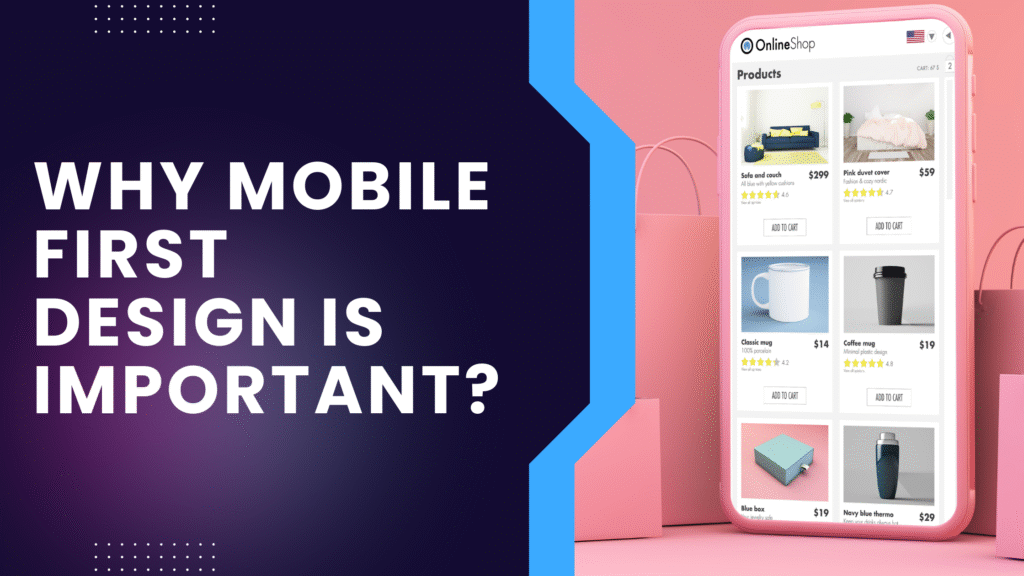
Mobile-first design is an approach where websites are initially designed for mobile devices and then scaled up for larger screens like tablets and desktops.
Instead of shrinking a desktop site to fit smaller devices, mobile-first design ensures the core experience starts from the smallest screen—making the website more efficient, faster, and easier to navigate.
📱 Why Mobile-First is the Future
1. Mobile Usage Dominates
Today, over 60% of global web traffic comes from smartphones. If your website doesn’t perform well on mobile, you’re missing out on a huge audience.
2. Google Prioritizes Mobile
Google uses mobile-first indexing, meaning it evaluates the mobile version of your website first when ranking pages. A non-optimized mobile site can hurt your search visibility.
💡 Read More: Google’s Guide to Mobile-First Indexing
3. Better User Experience
Mobile-first design leads to:
- Faster load times
- Touch-optimized interfaces
- Clean and focused content layouts
This keeps users engaged and reduces bounce rates.
4. Faster Websites
Mobile-first sites tend to be lighter and faster. With fewer graphics and scripts, your pages load more quickly—improving both user experience and SEO.
🔗 Test your site speed here: Google PageSpeed Insights .
5. Future-Ready and Scalable
A mobile-first strategy makes your website easily adaptable to new screen sizes and devices, from foldable phones to wearable tech.
🛠 How to Implement Mobile-First Design
Here’s how to get started:
✔ Start with small screens first – Focus on essential content.
✔ Use responsive design frameworks – Like Bootstrap or Tailwind CSS.
✔ Optimize all assets – Compress images, simplify code, and remove unnecessary scripts.
✔ Test across devices – Ensure consistency on phones, tablets, and desktops.
💼 Business Benefits of Mobile-First
For any business, going mobile-first means:
🚀 Better search engine rankings
📈 More traffic and higher engagement
💰 Increased leads and conversions
🛠 Lower bounce rates and higher ROI
At GD Marketing, we help businesses build modern, mobile-first websites that look great and perform even better. From layout to load time, we design with your customers—and their devices—in mind.
✅ Final Thoughts
Mobile-first design isn’t just the future—it’s the now. With mobile use only growing, designing with mobile in mind gives your users a seamless, fast, and enjoyable experience. Whether you’re starting from scratch or need a website upgrade, mobile-first is the way to go.
📞 Contact GD Marketing today to build a future-ready, mobile-first website that drives results!